Making it easier for customers to leave NOW TV
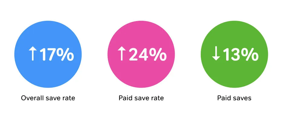
I was the UX Lead in the project to redesign the NOW TV cancellation journey. Amid stakeholders who were under immense pressure and challenging KPIs to reduce cancellations and lack of sufficient user research and insights, we ran an end-to-end user-centred design process that managed to strike a difficult balance between business needs to reduce cancellations and user needs to cancel easily. Within the first 3 months of launch, the new design saw a 17% increase in overall save rate (people changing their minds and not cancelling), 24% increase in paid save rate (customers taking up an offer and not cancelling) and 13% decrease in paid saves (the offers that were costing the business). Ultimately, customer feedback also showed that they found the cancellation process easier.
Context
NOW TV is a no contract dip in - dip out service. However, dipping out was more difficult than dipping in, mainly because customers were not able to cancel their subscription on any of the viewing devices. To make matters worse, the web interface was not mobile optimised (and 60% of cancellations journeys happened on mobile!). Add to that a series of generic pages to encourage the customer to change their minds, customers were constantly frustrated by the difficulty of cancelling their NOW TV pass. The Sales team commissioned the UX team to redesign the cancellation journey and simplify it. Traditionally, the Sales team have been heavily driven by business KPIs especially since Sky is a growth company that relies on new subscriptions as an indicator of business performance. Awareness of and appreciation for user experience and design thinking were generally lower than other teams within NOW TV.
My role
I led the UX design alongside a UX designer and UI designer, collaborating with the Project Manager, Product Manager, business stakeholders and engineers.
Challenges
- Lack of awareness of design thinking in the Sales team
- Lack of user research and insights
- Cultural fear of customers leaving
Process
The kick off
The Product Manager provided us with the following key requirements:
- Make it mobile optimised
- Make it personalised
The old cancellation journey
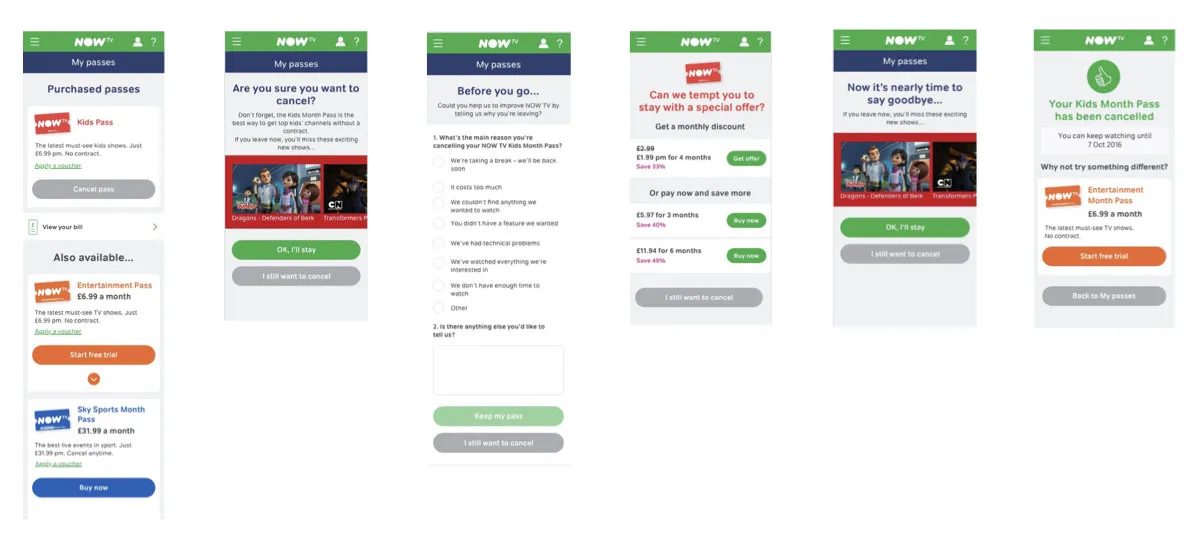
We reviewed the legacy cancellation journey and besides the screens being not mobile-friendly, we identified some major usability issues.
Quick wins: Mobile optimisation of existing journey
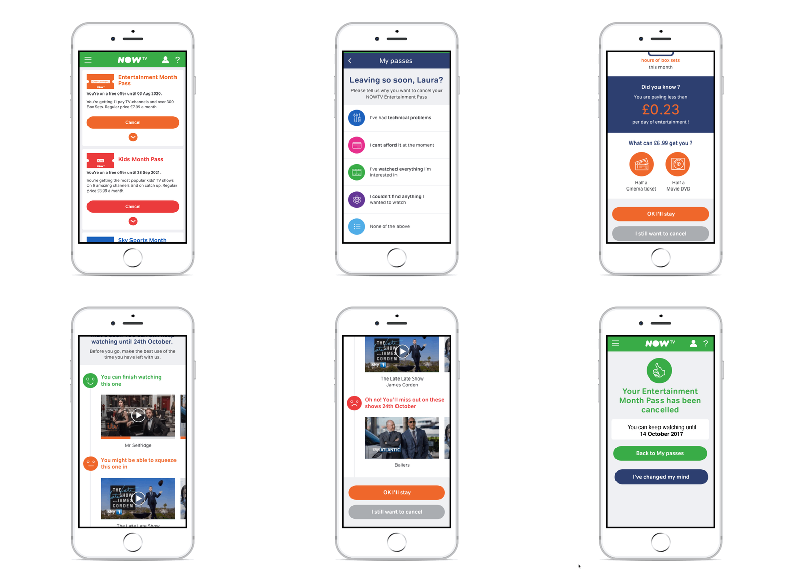
As a quick win to provide a mobile optimised journey for the 60% of customers who were cancelling on mobile, the UI designer mocked up a mobile optimised version of the existing cancellation journey, which was rolled out first.
While the tactical mobile optimised version was being built, we also kicked off a strategic redesign of the journey in parallel.
Collaborative design workshop
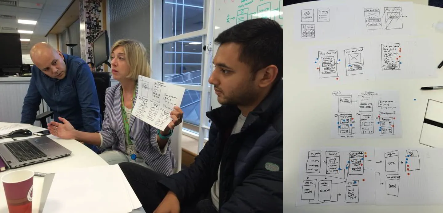
I organised and led a couple of collaborative design workshops with designers, developers and product managers. These workshops were aimed to make the process more inclusive for non-designers and enable rapid idea generation and cross-pollination of ideas.
The key themes that came out of these workshops included:
Attempt resolution:
- Try to resolve the customer's issues first
Reiterate value:
- Remind the customer of their past usage activity
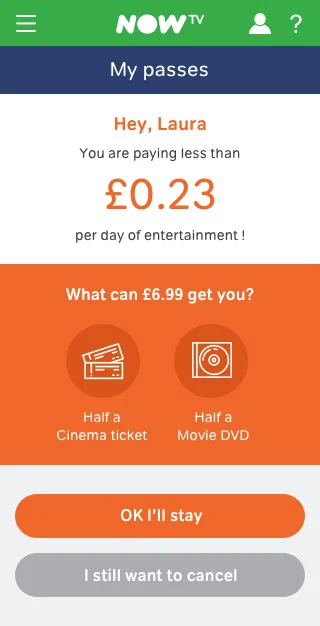
- Reiterate the value they are getting for the amount they are paying
Content discovery:
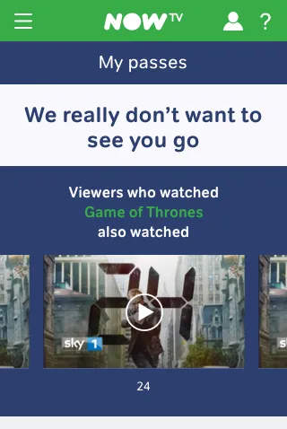
- Suggest content to watch before they leave
- Entice them with relevant personalised content coming up
- Help the customer discover relevant content based on their behaviour
Others:
- Offer ability to pause subscription and auto-renew
- Surprise and delight with offers and other unexpected incentives (free pizza, laundry, charity donation, Smartbox, etc)
Competitive reviews
We reviewed the cancellation journeys of competitors (Netflix and Amazon Prime) and other brands. A few of the cancellation journeys we reviewed had 1-click cancellations. Whilst these were the simplest to use for the user, they ended the relationship abruptly without any attempts to resolve possible issues. We wanted to strike a balance between enabling simple cancellation and gentle persuasion to stay.
Paper sketches
A fellow UX Designer and I collated the sketches from the workshops and further iterated them into more detailed sketches.
And some more paper iterations!
Stakeholder reviews
We continuously involved the stakeholders by inviting them into regular reviews of the designs. Some of the more playful interactions (e.g. 'spin to win' and rewarding customers for staying) were axed after feedback from several different stakeholders on their viability and operational challenges.
Digital wireframes
The UX Designer in the team created digital wireframes in Axure.
Hallway / guerrilla testing
Since we did not have research resource available for this project, we decided to go lean and conducted some hallway / guerrilla testing with randomly chosen Sky employees in a coffee shop in the Sky campus. We tested the different variations of the journey based on the price and content.
Key findings from user testing
Price comparison needs to be relevant
Participants generally liked the idea of price comparisons with the value of other items but also mentioned that the items compared with needed to be relevant to the user. E.g. one participant said she didn’t drink and comparing the cost of NOW TV pass with the price of beer was not relevant to her. We used this insight to keep the items common and generic to start off with.
TV viewing metrics can be perceived negatively
Showing the usage metrics (how many hours the user has watched NOW TV and how much value they got out of it) was perceived negatively as the participants said it would make them feel bad about watching too much TV. Or if they hadn’t used NOW TV much, then it would further reinforce their reason to cancel.
Relevant content recommendation is useful
Showing content relevant to the user’s preferences and watching habits was considered useful to most participants and some also said it might change their mind from cancelling.
Complex calculations to determine better value are off-putting
We also found that the Offers page was too complex for the user to understand easily. As customers, they would be constantly seeking better value and would make calculations in their heads to figure out which option would be better value. This added cognitive load was considered frustrating.
Overall, the participants felt that the cancellation journey was not too long and the elements designed to persuade them to stay were not too annoying, especially the content-based recommendations which was considered useful. Although some said they would still cancel, they also added that the journeys made them aware of the value they were getting from NOW TV and the content and the features they didn’t know about.
We presented these findings back to the stakeholders with the caveat that these were randomly chosen Sky staff and not real NOW TV customers.
Key psychological heuristics
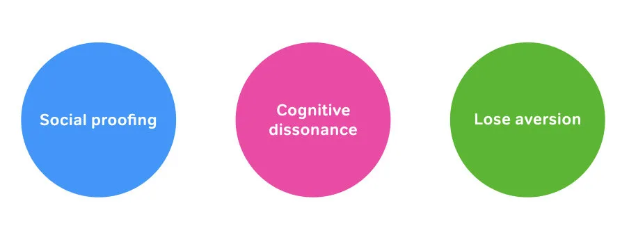
We also used some psychological heuristics to make our design decisions to persuade customers to stay without frustrating them.
Social proofing: People assume the action and behaviour of others to be correct
We displayed social data in the cancellation journeys to highlight customer usage and behaviour and popularity of relevant content to encourage customers to imitate the more common actions and behaviours.
Cognitive Dissonance: People tend to avoid cognitive dissonance (lack of harmony), a state which occurs when there is inconsistency between their attitudes, thoughts and behaviours
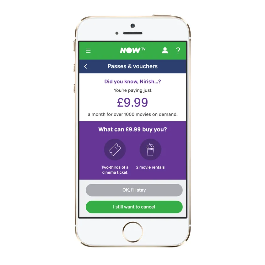
We attempted to create cognitive dissonance in various parts of the cancellation journey and encourage customers to remove the dissonance by aborting the cancellation journey. For example, showing the value gained vs price paid in smaller units of measurement to reinforce the affordability of the product, showing the customer lifecycle and a break in the lifecycle and the value they will miss out on if they were to cancel.
Loss aversion: People have a stronger tendency to avoid losses than to acquire gains
We wanted to reiterated the value that customers had stored into our product which they will potentially lose if they cancel. These included the content in their Watchlists, Recommendations, etc and any personalised data that helped them find more relevant content. Features and technology to encourage and enable viewers to store more value into the product with continual usage was its infancy at NOW TV. Hence, we decided to park this concept for later.
UI design
After a few minor iterations of the Axure wireframes, the UI Designer built the final visuals, which were reviewed and iterated through internal stakeholder reviews and showcases. The final assets were delivered to the engineers using Zeplin.
One of things that I could've push harder was to make the cancel button the primary call to action and make it more prominent as that was the main goal of the user. However, one of my direct reports, a Senior UX Designer, who joined the team and the project later was able to convince the business owner to let us make the cancel button the primary CTA.
Outcomes
We knew that the journey wasn’t perfect and customers still had to go through multiple steps to cancel their pass. However, the new journey was a major step towards a simpler and more personalised cancellation process and more customer-centric ways of working within the Sales team. Based on the metrics that the team was monitoring and measuring during the first 3 months of launch, we saw that the new cancellation journey had a significantly positive impact:
- 17% increase in overall save rate (people changing their minds and not cancelling)
- 24% increase in paid save rate (people taking up an offer and not cancelling)
- 13% decrease in paid saves (the offers that were costing the business)
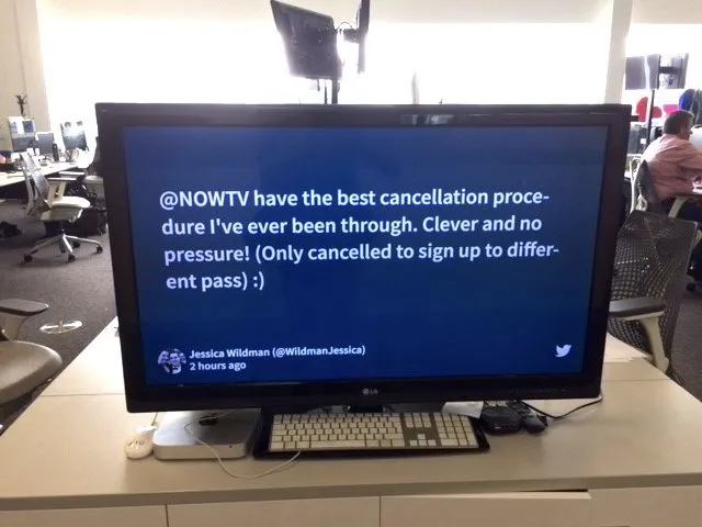
We also received positive feedback from some customers on the simplicity of the cancellation process.
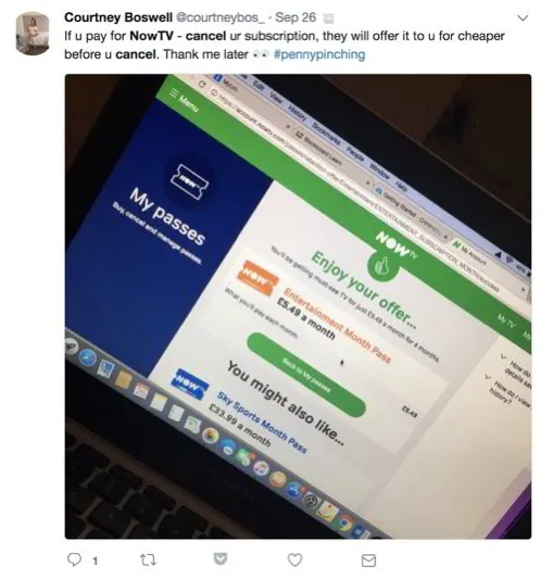
As expected, some customers deliberately used the cancellation feature to receive better offers for the passes. :)
